

Consistency has been the operative word at Crystal Palace over the last decade, despite some patchy form here and there, the lowest Palace have finished in this time frame was 15th under Alan Pardew. Running parallel to our success on the pitch has been a plethora of outstanding shirts both Home and Away. The 2022/23 season marks our 10th consecutive season in the top flight, and Macron have managed to produce a kit fitting of such a landmark campaign.
A few sceptics became particularly vociferous when Macron were announced as the new kit manufacturer following a successful period of tidy efforts from Puma. Further questions arised as to how much our previous employers could contribute financially to the club, given the wealth of the powerhouse Puma.
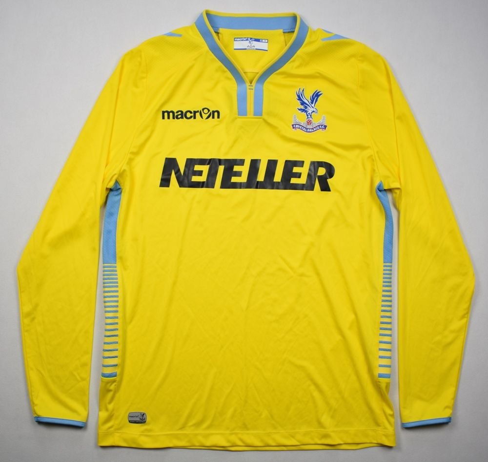
However, the majority of the fanbase will fondly remember their previous four year stint between 2014-2018 which included some immaculate designs including our Red and Blue strip for the FA cup final, a clean black away design with a horizontal Red and Blue line in 2017/18 with the one season wonders Neteller benefitting from Macron pulling off a classic yellow strip with Baby Blue trimmings, making it a kit very reminiscent of our promotion clinching side in 2004. Prior to this years efforts, Puma have undoubtedly contributed with an array of fine attempts, including what last season appeared to be an FYP inspired barbers strip. 2019/20 brought a rather swanky looking black away shirt with curling red and blue stripes shaped down the middle.
Given Puma’s successes, a few concerned eyebrows were undeniably raised when Macron were confirmed, and some of those protests became even stronger with the release of a peculiar looking White away number. Initially, the squiggly red and blue lines placed vertically down the white jersey appeared too childish and scruffy, yet after longer and closer deliberation many members of the Palace fan base are starting to appreciate a more outward design. The streetwise creation feels in keeping with the culture that surrounds the Football Club, an artistic flair that seems to remember the surrounding area whilst also embodying several of our dynamic and entertaining players including academy products Wilfried Zaha and Jesurun Rak-Sakyi.
Strong contender for best kit combination of the season from Crystal Palace ??#CPFC pic.twitter.com/mLVdQq2eCG
— Sport Social (@TheSportSocial) July 11, 2022
That entry into Palace’s ever-growing roster of unique kits was made even better by the addition of the 2022/23 season’s home shirt, a gloriously constructed design which has a detailed intricacy which makes it appear effortless. The same sort of squiggly lines that were evident in the away kit are present once again, just in a slightly thicker fashion, all over the shirt. This quirky addition is supplemented by tidy white cuffs on either arm with a bold collar making for a striking kit. Palace’s proud Red and Blue colours can be seen merging together making for an intricate pattern that is symbolic of the unity that Patrick Vieira has been able to forge during his short time in SE25, and if Palace can keep churning out kits as strong as this one, then that unity and sense of belonging will only grow stronger. On a side note, this season’s sponsor Cinch not only looks clean and solid on the kit itself, the fact that it isn’t some random betting company from Asia restores even more pride in the club.
The Eagles have now utilised a third kit for the last 5 seasons and hence you can bet that Macron will soon release another strip, but what colour will it be? Given the fact that Palace have always used a loose rotational system, last seasons absence of a Black shirt suggests that there is a strong likelihood that this will be the preferred colour. We can also assume that the squiggly line pattern will be used once more, hopefully completing a thrilling trilogy. Undeniably, there have been a few duds (Who remembers the 2006/07 season’s grey monstrosity) yet it is difficult to find one team that has been as consistent as Palace with the quality of their kits. Maybe it’s just bias, but our kits are another factor which make this grand old club so unique and appealing.
Here is a quick rundown of my Top Ten favourite taken from my lifetime (2004 onwards so forgive me for leaving out absolute classics)
2022/23 Home
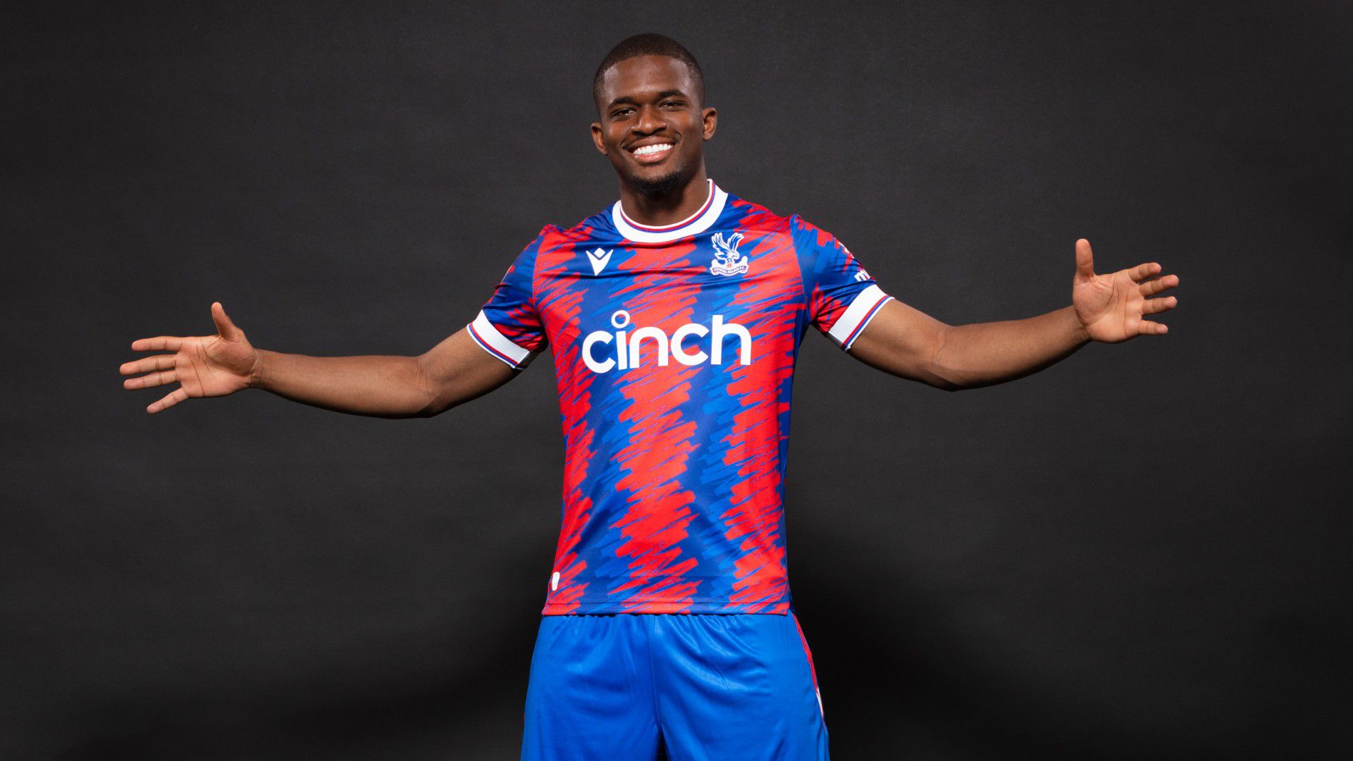
Perhaps for this one I’ve been blinded by a recency bias but for me this is a gorgeous Kit which embodies the affluent spirit of Crystal Palace, whilst also being mesmerising to look at.
2016/17 Away

Very controversial yet this one has a lovely tinge of Red and Blue on the cuffs and collar with a brilliant, traditional Palace sash running diagonally across a darker shade of yellow that was always striking in person.
2015/16 Away
This white strip involved red and blue shades on the collar and cuffs with a vertical line attached down the centre, making for a simple yet superb design that maintains Palace’s History of producing impressive white kits.
2005/06 (centenary kit)
A nod to the past never goes unnoticed and the Claret and Blue design reminiscent of Palace’s origins also has an excellent design with the badge placed through the middle, making this a shirt completely unique to the Palace.
2019/20 Black Away

This would probably be top for the most attractive looking on this list, with the spiralling red and blue stripes creating a very distinctive design which has terrific shoulder padding that contributes to the shirts gushing flair.
2015/16 Home

Our FA Cup Final strip was simply just classic Palace. There wasn’t anything particularly extravagant our stand out when it comes to the design, yet the bold colours with a slight yellow trim around the cuffs just oozes Crystal Palace.
2012/13 Home

Maybe this one is tinged with nostalgia given that this was our famous promotion kit, yet the bulging Red chunks where something different in comparison to kits gone by and it will always be associated with success.
2014/15 Away
This entry was something of a call back to our promotion kit of 2004, worn by Millenium heroes Nico Vaesen and Neil Shipperly, yet its light colours seemed to protrude in the flesh and was worn in our most successful Premier League campaign.
2021/22 Third Kit
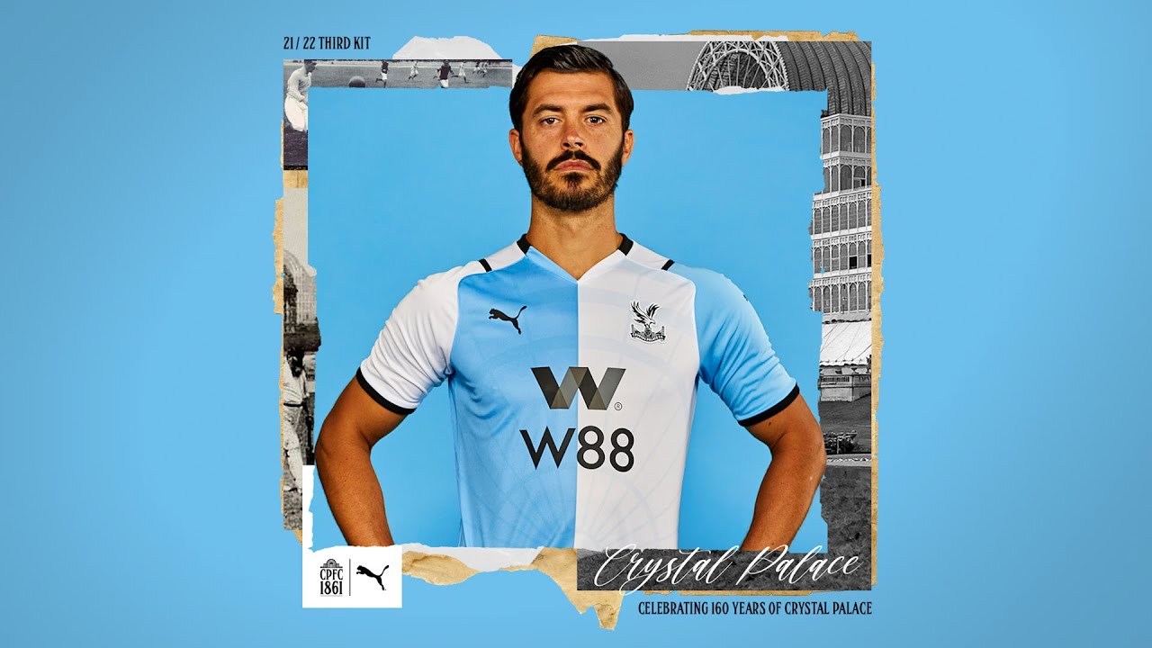
Debate rages on about Palace’s supposed 1861 origins, but the tribute kit has an old school feel to it that, despite evoking resemblance to Blackburn, has a nice black trimming around the shirt with a subtle imprint of the crystal Palace in the background.
2008/09 Away
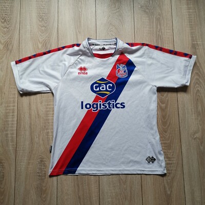
This is the perfect Palace sash. The white background is a stark contrast to the glorious red and blue diagonal line that runs down the shirt, with Palace’s colours forming around the shoulders, making it the definitive Palace sash since the days of Vince Hilaire
Those are my picks of the top ten Palace during my lifetime, but what are yours? Please send your choices direct the FYP!